Mobile app redesign, self-initiated concept (not affiliated with Trash Panda)
Trash Panda redesign
- The problem
- Customers couldn’t find list of recyclables, rates or cancel a booking inside the app, so they went to Facebook or email instead.
- The outcome
- Rates, accepted recyclables and cancellation now live in the app, with clear confirmations; testers called it a huge improvement.
- My role
- I ran the research, synthesis, sketching, UI design and usability retest.
Context
Trash Panda is a small local recycling service that helps customers book pickups and understand what happens before they commit. The app needed to support simple, high-frequency tasks like checking acceptable materials, understanding fees, and cancelling a booking without forcing people to switch to Facebook or email.
Customers left the app to finish simple tasks
The app was easy to use, but missing answers pushed people to Facebook, the website or email that creates a lot of work for a small team.
How I researched
- Read comments on the company’s Facebook page for the big picture
- Invited commenters to interviews and usability testing
- Ran one round of usability on the current and redesigned app
- Grouped findings into themes and ranked them by how often they came up
Who it's for
A waste-conscious customer who wants to books recyclable pick-ups and wants to know what to expect before she commits.
Design objectives
- Make key service information easy to find
- Keep the app simple
- Give the business a systematic way to track cancellations, or booking
- Reduce frequently asked question in the Facebook and email channels
Pain points found
- Unsure which items are accepted, people ask in Facebook comments.
- Some assume the service is free, as if run with local government.
- They want the base rate to compare with other services.
- Booked users check email or simulate a booking to work out fees.
- They expect a map showing the driver’s location.
- Cancelling happens through Facebook message or through email. Missing this notification will still cost the business.
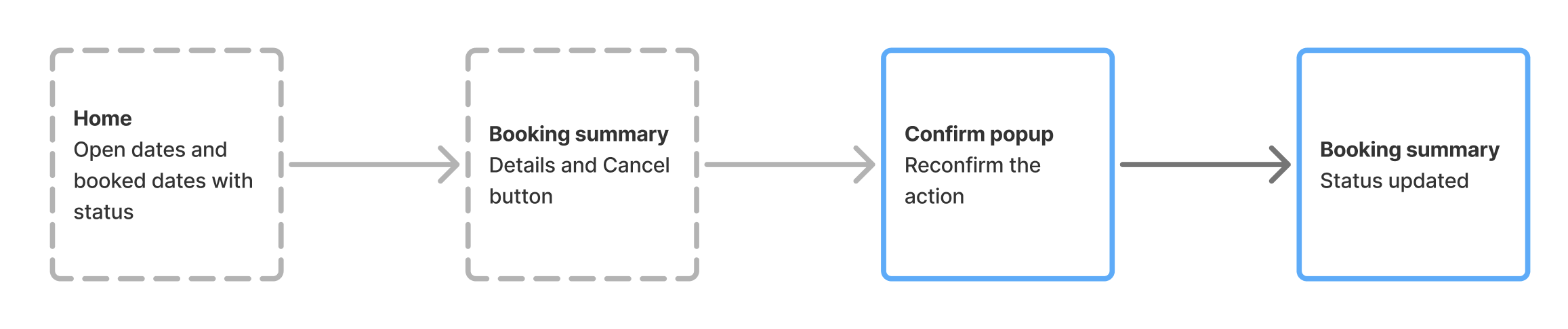
Cancelling became a path inside the app
Low-fidelity flow of the new cancellation logic. Dashed boxes are existing screens, solid blue boxes are new.
Where information moved
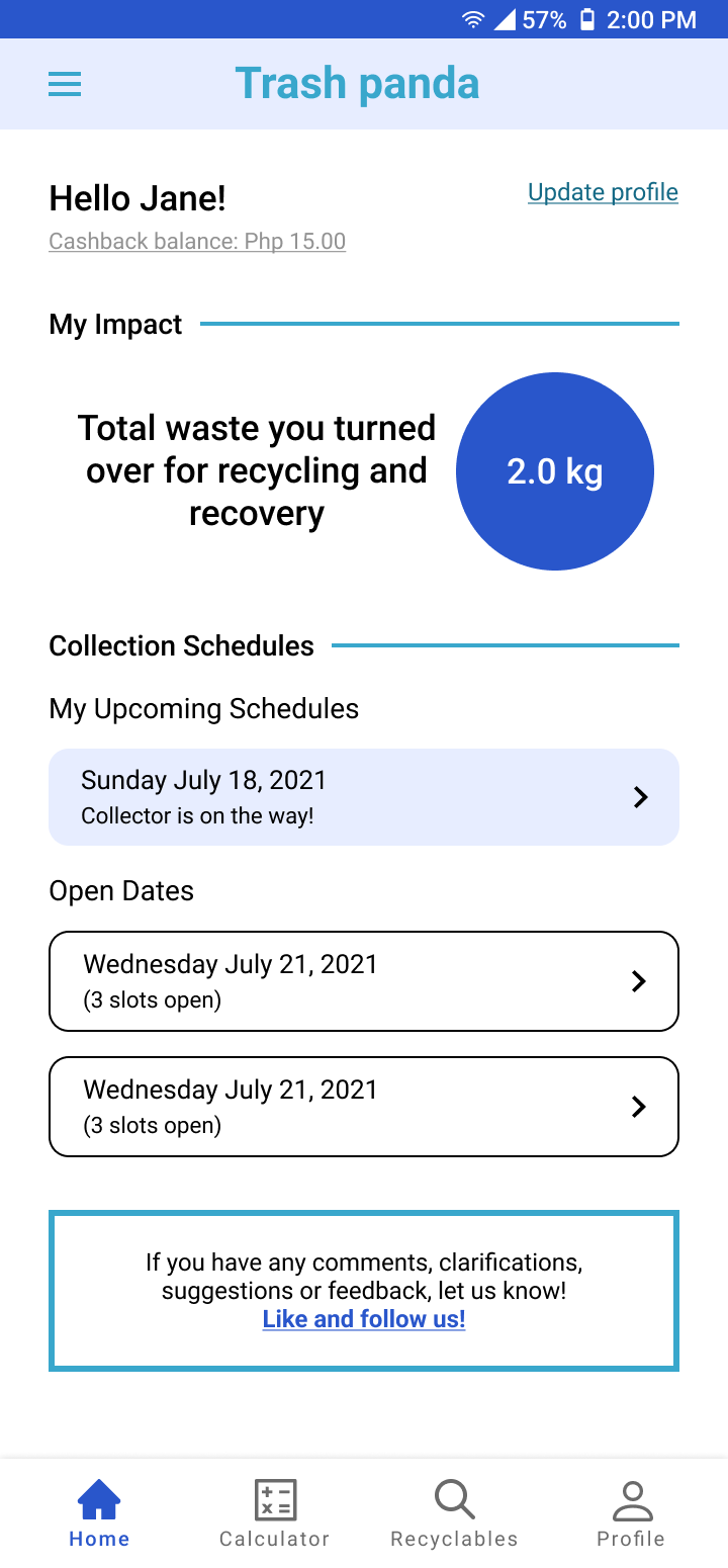
Secondary information lives in the hamburger menu that gives it dedicated screens, so the home screen stays focused on impact and schedule. A bottom nav bar gives direct access to the key information: fee calculator and accepted recyclables.
Before and after, change by change
Browse the before-and-after screens, then read why each change was made.
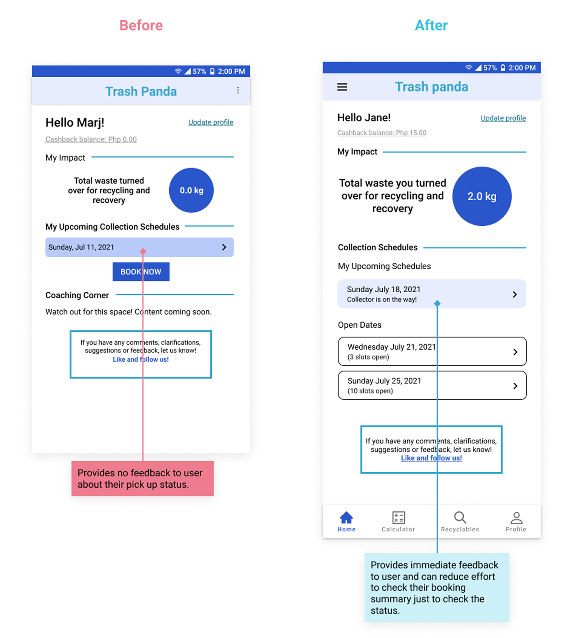
Booked users were already checking email or simulating bookings to see availability, so the home screen now shows it.
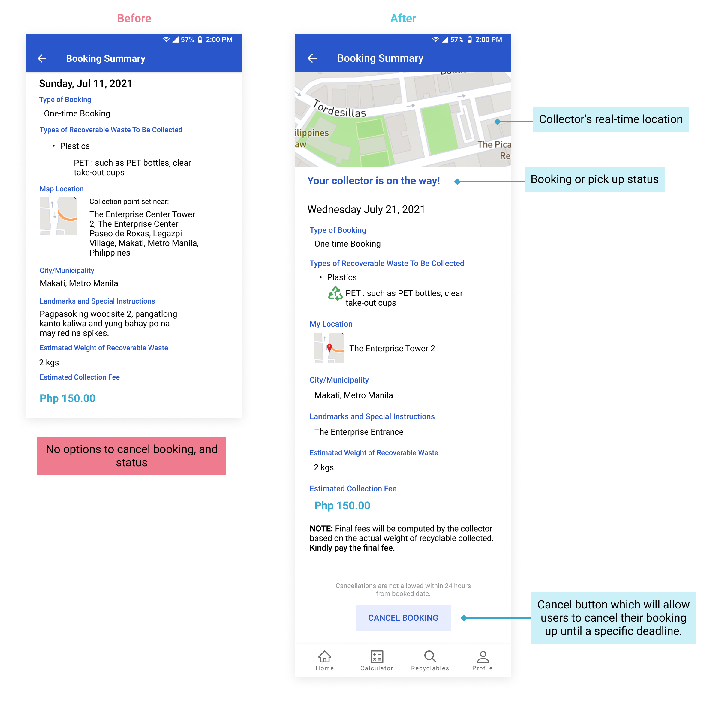
Easy to reach, and visible to Trash Panda. When it’s disabled, a written note says so, so the state isn’t left unexplained.
.png)
Users know the system received their request and can reverse a mistake.
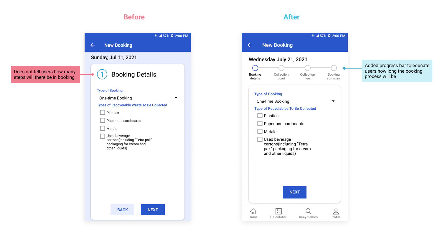
Shows how many steps remain, where you are and what’s done.
What the testers said
One round of usability testing with the same tasks as the current version: Find out if they accept the specific recyclable, determine how much would the booking be, and cancel the booking
“This design is a huge improvement to the current app as it addresses the areas that the app could improve on.”
“The design makes task simpler since its all available now.”
“It was a bit new to me but its good that there are other option to check this instead of waiting for an open schedule.”
How I measured it. Participants repeated the same tasks in Maze on the new design. I aimed for convenience rather than time on task; efficiency followed from giving people what they needed.
What I learned. Recruiting beyond the company’s own page would reach more varied users. And small changes for me were big adjustments for users, so not every redesign succeeds on the first pass.