Web app dashboard redesign, Theoria Medical
From a schedule to a tactical dashboard
- The problem
- The physician dashboard showed a schedule, not the tasks that needed attention, and physicians had to leave encounter notes to review documents.
- The outcome
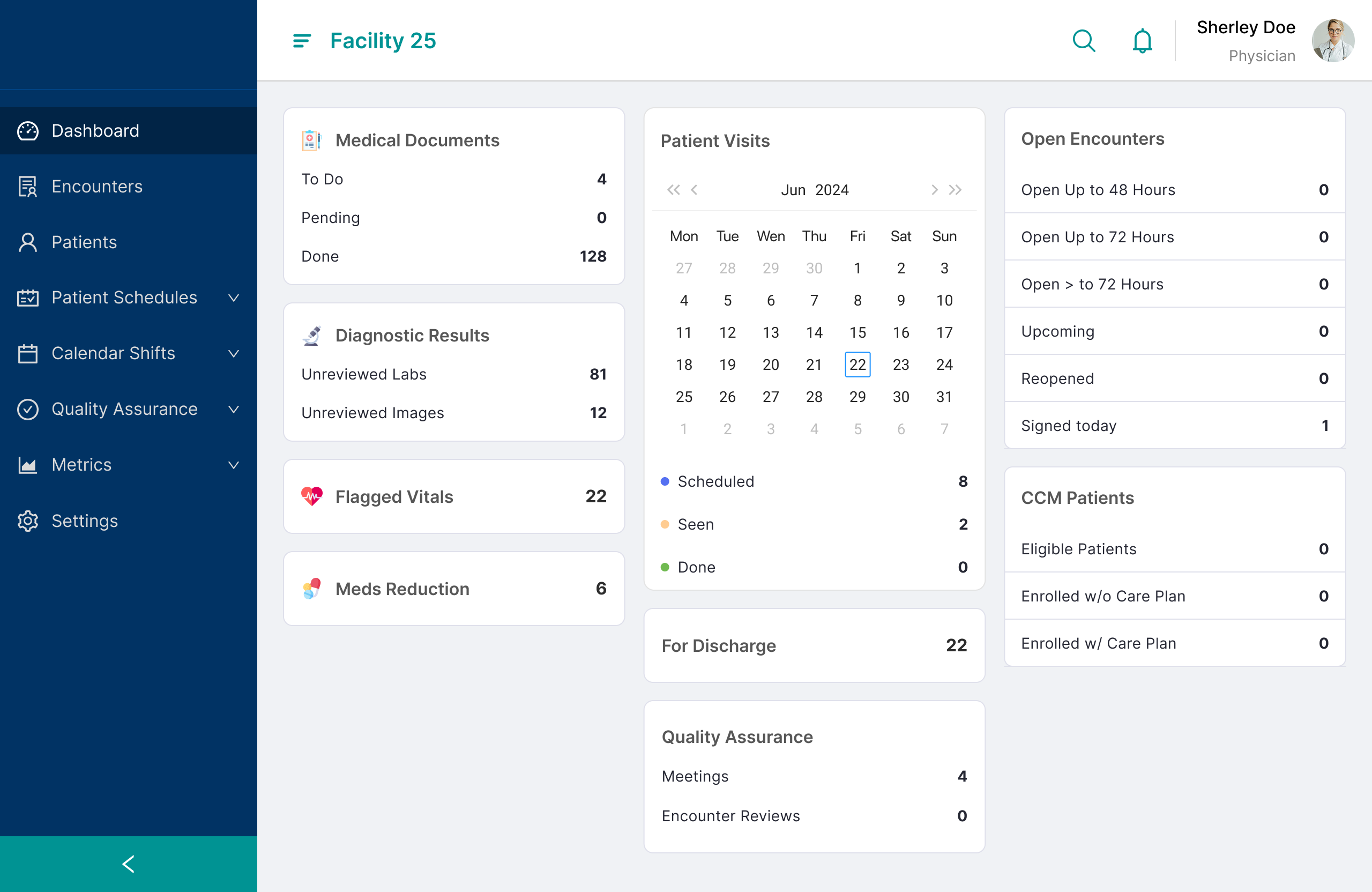
- A task-based dashboard in three groups, with filtered action pages, and flagged vitals and medications to reduce brought into the encounter note.
- My role
- I joined at brainstorming, researched the pain points, contributed dashboard layout ideas and integrated the workflows into encounter notes.
Physicians kept leaving the note to find what they needed
Theoria Medical offers on-site medical staff and telemedicine. Its physicians use proprietary apps, including a specialized EHR. Care plans depend on labs, medications and medical reports, so that information has to be at hand.
The challenge
Improve completion of tasks and progress tracking for documents and workflow tasks.
How I researched
- Gathered information through team channels
- Watched for emerging themes
- Retraced a physician’s steps in the app to find pain points
Who it’s for
Physicians who see patients at facilities and must assess, document and sign each encounter.
Pain points found
- The dashboard solely focused on the physician’s visit schedule, not diagnostic findings, facility or organization tasks.
- Navigating and filtering documents on the medical documents page took multiple steps
- During visits, physicians left the encounter notes to check documents or reports.
Mapping where the visit workflow breaks
Two loops stand out: finding the encounter note, and going back to find a medical document mid-visit. This is whre time is lost
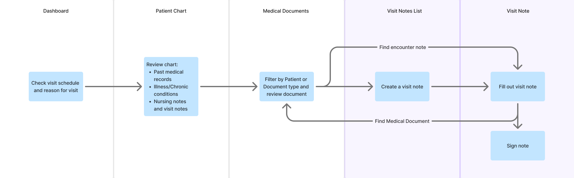
Proposed flow
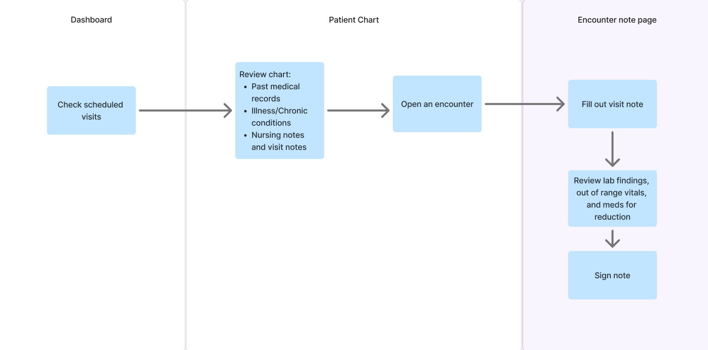
How tasks are grouped
Tasks fell into three groups, ordered from most to least important: medical documents or reports to be reviewed, schedule-related tasks and progress, and encounter note progress.
Three layouts, one that could scale
We presented three wireframes as final options. Switch between them to compare.
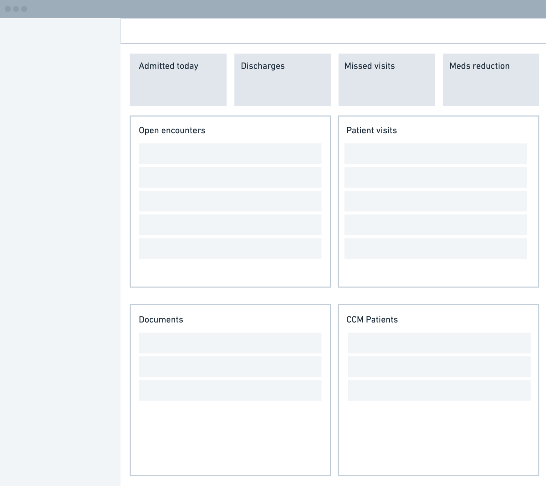
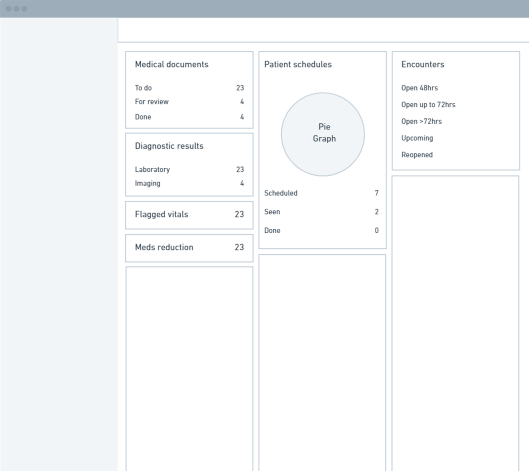
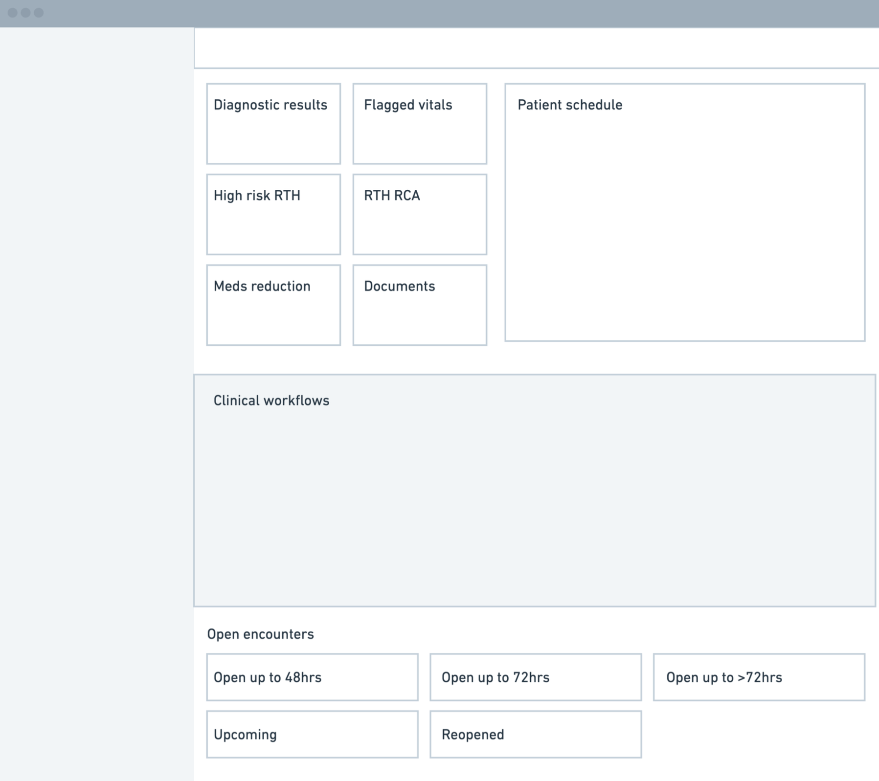
- Option 1: summary tiles first.
Tiles for admitted today, discharges, missed visits and meds reduction sit above lists of open encounters, visits and documents. - Option 2: task widgets beside the schedule. Chosen.
Medical documents, diagnostic results, flagged vitals and meds reduction sit with patient schedules and encounters. We pushed for this one because it scales better, and built it around visits and encounters as proof of work. - Option 3: alerts above a clinical workflow area.
Clinical results and flags lead, followed by a large workflow space and open encounters grouped by time.
Patient data now lives inside the encounter note
Each dashboard widget opens a filtered action page.
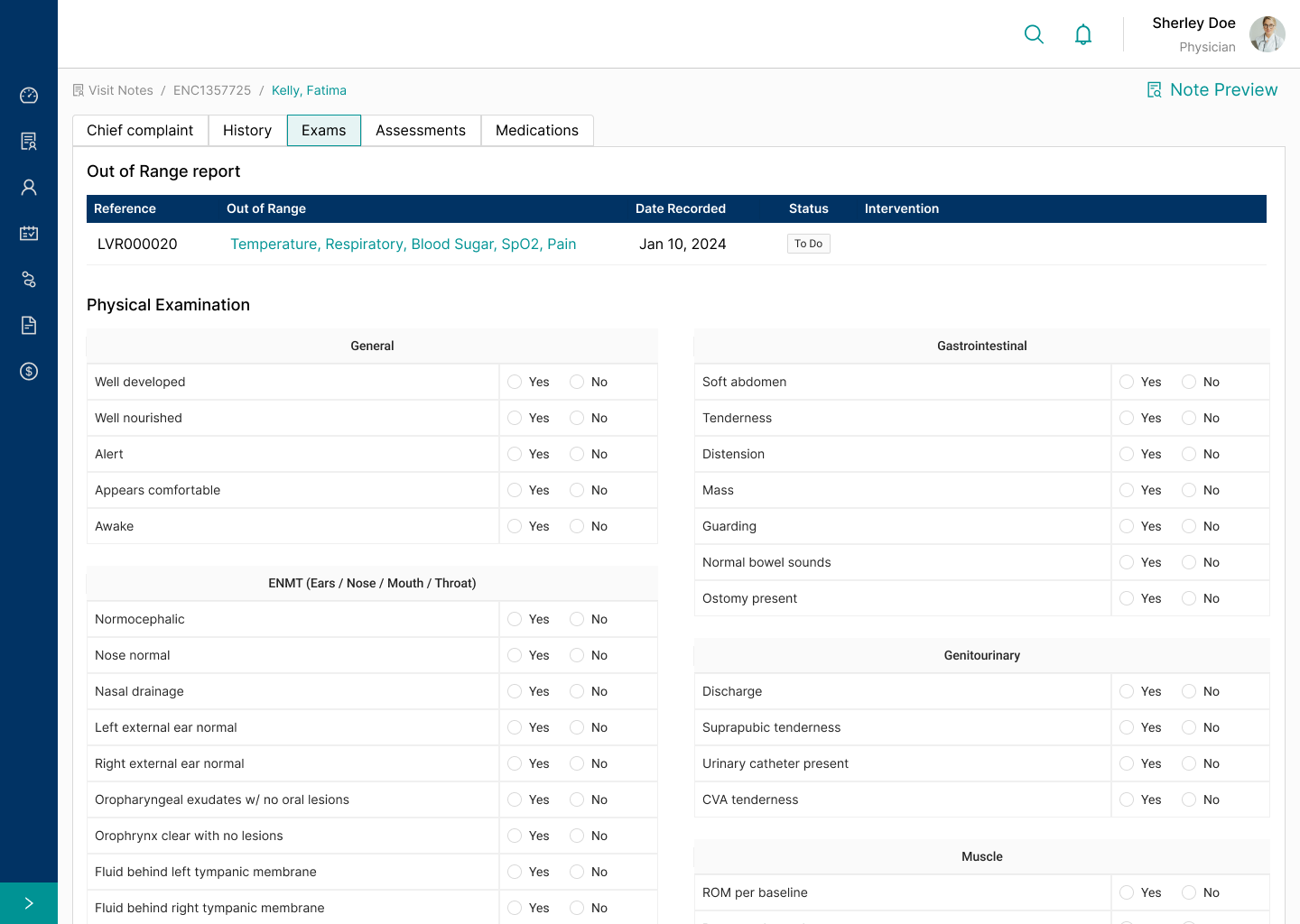
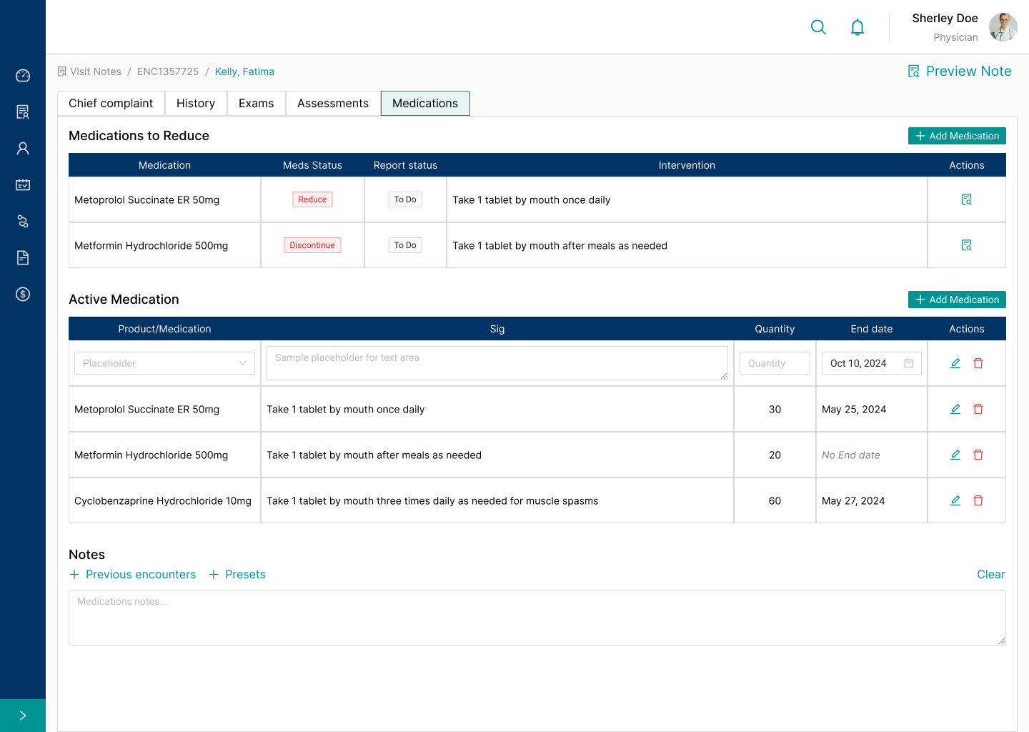
What we learned.
Providers:Bringing the workflows into the encounter note saves time in decision-making and signing note but the dashboard needs refinement. They prioritize their schedule for the day and work through the medical documents from there.
Admins: Provides an improved way of monitoring medical documents and clinical workflows.
Next steps
Observe users on the current dashboard to iterate on the schedule-based concept. Then test the proposed dashboard against document completion rate before or during visits, and pinpoint which data belongs in this view.